Showing posts with label changes. Show all posts

30 October 2012

A new look for the main article

This is the first post in a new format. A change of font and a focus on the current article will refresh the blog and make it easier to read. There are also several other ways to see 'Journeys of heart and mind'.

The old style blog
From now on I plan to offer articles in this new font and display them in their entirety.

Here's a sample of the old font.

I'm also widening the text area as screen widths have continued to increase and can usually accomodate the new size.

I'll only display a single article (in the past I've offered three truncated articles). Some adjustments and simplifications to the right hand column have further simplified the layout and the images will be larger in future.

I posted my intention to make this change several weeks ago, hoping for some feedback. But it's not too late! Leave a comment to tell me whether you think the new style is an improvement or not.

Dynamic views - There are several other ways to view the site, maybe you'd like to experiment with them. These are alternatives to the normal view so find one you prefer and bookmark it so you can revisit whenever you like. Or bookmark several if you like more than one.

  • Classic - See the current article in full, scroll down for previous posts.
  • Flipcard - An album of images, hover to flip them, click them for the full article.
  • Magazine -  Looks like a magazine page with articles arranged in blocks.
  • Mosaic - Pick a picture.
  • Sidebar - Titles on the left, article on the right.
  • Snapshot - Like a set of photos, hover and click for an article.
  • Timeslide - One photo, several extracts, and all titles month by month.

Mobile devices - There's a separate version of the blog for mobiles.

Sign up - Don't forget that you can also receive the blog posts by email or read them in an RSS feed. The 'Subscribe' tab has all the details.

See also: Changing the websiteEnjoy the viewA new look for 'All about Jesus'

18 October 2012

Changing the website

It's time to change one or two things about this blog, and it would be good to have some suggestions from my readers. I'm considering changing the way articles are displayed, and I've already modified the range of other blogs I link to.

The Journeys blog in October 2012
I like to check how well the blog is working from time to time.

If necessary I can make some changes. I don't like to change things often as it may cause some confusion, but sometimes a few improvements are necessary.

Recently I added quite a few additional items to the 'Other Blogs' section in the right-hand panel. In a later section of this article I'll explain why.

Current article - But first, I'm considering another change and I'd like to know what you, dear reader, think about it. At present, the default page includes extracts from the three most recent articles and you have to click a 'Read more' link if you want to see an entire article. I might change this.

How would you feel if instead, I displayed just the first article but showed it in full? That way you would never need to click 'Read more...' to see the current article. I'm considering displaying it in a larger font too, any comments on those changes? Of course, you'll still be able to read older articles from the 'Article Archive' which I might move to a more prominent position.

I've noticed a few other blogs doing it this way; I think it works rather well and is easier to read. There are other possibilities as well. I could, for example, make the extracts much shorter, perhaps leaving out the images, and provide many more extracts per page.

Blog links - Now back to those links to other blogs. In the past I have mostly included blogs about the Way (what you might call 'Christian' blogs). But I'm interested in many things and would like to share more of them with you too. I've therefore added more links to blogs on science, the environment, space, history and astronomy and will probably add more again.

I'm currently displaying the ten blogs with the most recent new posts, newest at the top. At peak activity times, this seems to cover about an hour or two. During the night it will be a bit longer, say three or four hours or so. There's a 'Show All' link at the end of the list that you use to see the older items.

Please leave comments to let me know what you think of these changes; if you have any objections please say what they are and let me know why you object. In a week or so I'll make the changes whether or not there have been any comments, but if there are comments I will consider them carefully first.

It's your chance to influence 'Journeys of heart and mind'.

Are there other things you would like to see changed? If so, do let me know. I can't promise to implement every suggestion, but I will consider them all carefully.

See also: Enjoy the viewA new look for 'All about Jesus'

12 November 2011

Enjoy the view

For several years I've been offering exciting alternative ways of reading the AAJ blog. These browse views depended on a Google service that had remained experimental until a few weeks ago. Now it's gone mainstream.

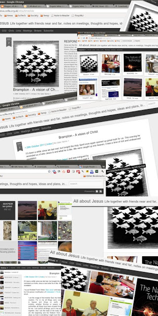
Google is calling these dynamic views - and that is what they are. Please take them for a spin, they're great fun! They are as different from the usual way of reading a blog, as flicking through a photo album is from reading a book.

We'll take a quick look at each of them in turn. Begin by clicking the 'Browse' tab below the main banner at the top of the page. Now click the image or the 'Go for it!' link (they both do the same thing). You'll see two gears turning and then you'll see the default, 'Mosaic' view. The only way back from here is to click the blog title 'All about Jesus' in the top-left corner.

  • Mosaic - This view lets you browse the images from the blog articles. More pictures appear as you scroll down. Hovering over an image makes it expand slightly and the article's title appears. Clicking an image brings up the full article but you can still scroll up or down to see more images. Point to 'Mosaic' in the black bar to select another view or click the blog title to return to the old, standard interface.
  • Classic - In the 'Classic' view you see the full text of the articles, as you scroll down more and more will appear.
  • Flipcard - Here you will see a regular array of images. As you hover over an image it will flip over to reveal the article's title. Click the flipped picture to open the article.
  • Magazine - This view shows a summary of the most recent article with images and extracts of older ones below. Once again, click and article to open it.
  • Sidebar - Here you will see the most recent article along with a left sidebar with small images and abbreviated titles for older articles. Click these to open them.
  • Snapshot - This view looks like a table top covered with photos. Hover over them to expand and straighten them, click to open them.
  • Timeslide - Finally, the 'Timeslide' view is good for scrolling far back very quickly. Only a few images are shown but in a good size.
And remember - click the blog title 'All about Jesus' to escape from these various browse views.

See also: Changing the website, A new look for 'All about Jesus'
26 September 2011

A new look for 'All about Jesus'

It's good to refresh things now and again, whether it's church, the decor, lifestyle or just a website.

The old version
The appearance of 'All about Jesus' has been fixed for a very long time. So welcome to the new look! Under the bonnet (as we say in the UK) nothing has changed. The content is the same but it's been poured into a fresh container.

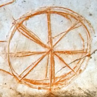
A word about the banner and the little icon that appears on your browser's tab - this pizza thing - what is it and why is it here?

The clue is the Greek word 'Ichthus' which you can see in the banner. 'Ichthus' means 'fish' and it was used by Jesus' early followers as a symbol on a house or a door. The same idea is still used today, you'll sometimes notice a car with a stylised fish sticker - it just means 'we follow Jesus'.
The Ichthus icon
The round symbol is what you get if you write out the Greek letters for Ichthus but instead of side by side you write them all on top of one another. Here's a list of the letters, can you see each one in the 'pizza' shape?

For fuller details read the 'ichthus' article.

Copyright

Creative Commons Licence

© 2002-2022, Chris J Jefferies

This work is licensed under a Creative Commons Attribution-ShareAlike 3.0 Unported License. A link to the relevant article on this site is sufficient attribution. If you print the material please include the URL. Thanks! Click through photos for larger versions. Images from Wikimedia Commons will then display the original copyright information.
Real Time Web Analytics